Overview
Background
Since 1987, Boulder County Farmers’ Market (BCFM) has worked to connect the community to local agriculture. During the Covid-19 pandemic, they began offering online ordering, which was successful enough that the organization has continued offering local pickup/delivery year-round.
Problem
Currently, users face a few different challenges to achieving their goal of discovering and reserving unique, seasonal produce not found elsewhere.
Poor login flows are so frustrating that users either leave the site without ordering or their desired produce is sold out by the time they log in
Users want to be enchanted by the stories of products, farms, and featured items; right now info is scarce
Users often only remember to order at “Last Call,” and by then, the items they’re most excited about are sold out
Solution
Design an end-to-end mobile application with an optimized login flow, engaging storytelling about products and farms, and reminders to order before their favorite items sell out.
Research
I wanted to know the goals and challenges users had when they interact with the current product, so I conducted contextual inquiries via Zoom to observe their behavior and listen to their frustrations. I also reviewed several competitors to learn more about existing design patterns and features.
View the Research Plan and Script
Findings
Contextual Inquiries
Users’ Primary Motivation is DISCOVERY
They prioritize items that are new to them, highly unique, or only available for a limited time.
They’re not sure what constitutes Featured Items, so they browse all items in order not to miss out.
Users Expected to be Enchanted
They want the stories of the products and who made it. They’re frustrated by the lack of product and producer info, and they’re annoyed that the Product Page doesn’t show any additional info compared to quick view.
Difficulty Making Purchases
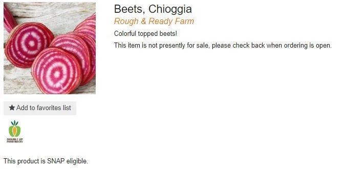
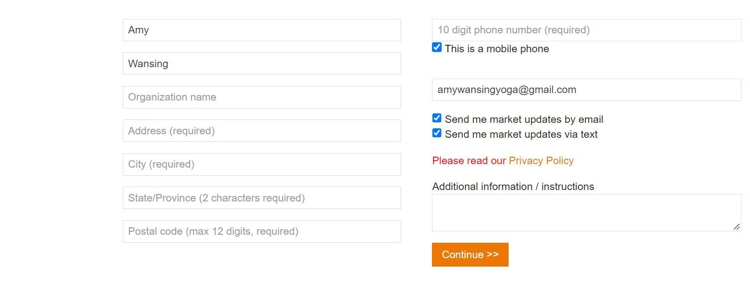
The current site forces users to log in before adding an item to their cart, and every interviewee said they would rather leave the site.
Also, users typically order at “last call” when their favorite items are sold out. They need better reminders to maximize availability.
Comp Audit
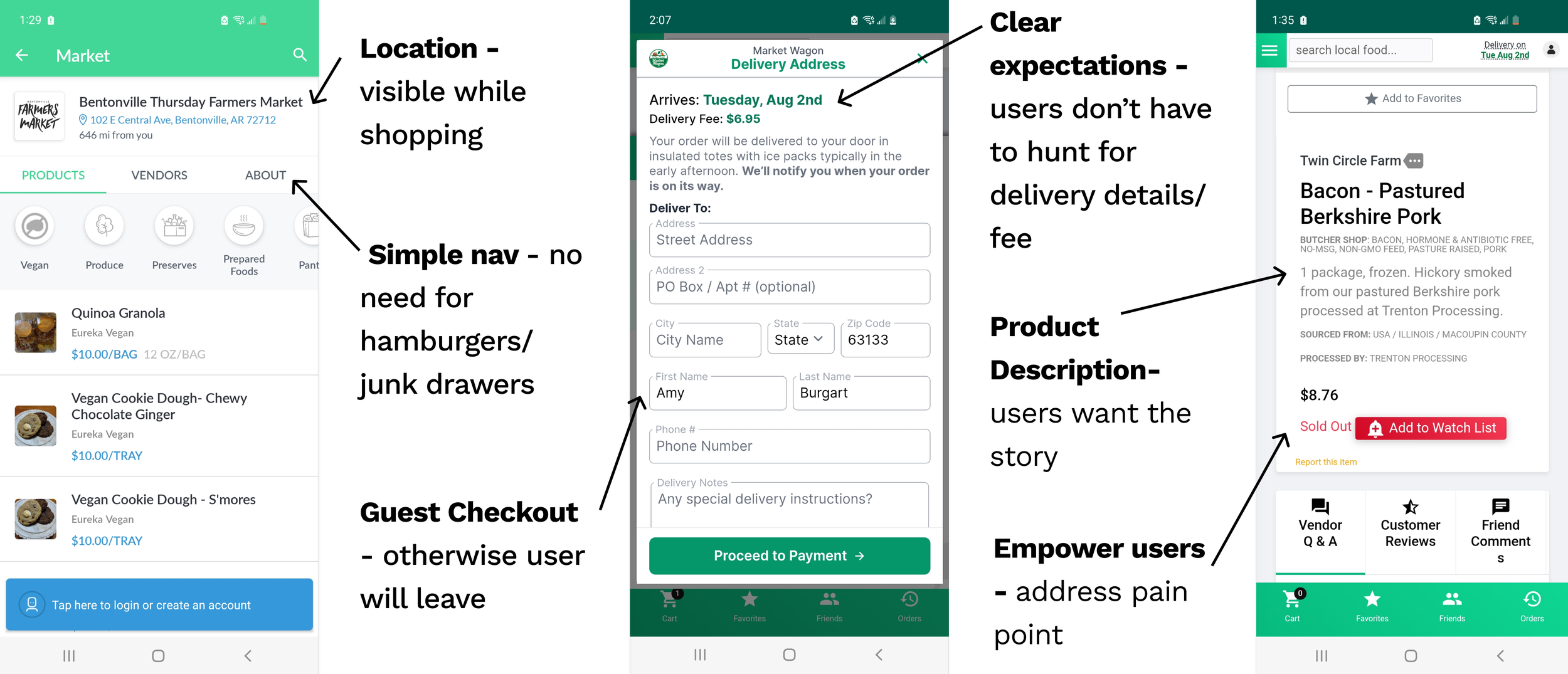
With the explosion in popularity of grocery apps since 2020, I wanted to see what design patterns and features users had come to expect. I analyzed hundreds of screens across dozens of apps and noted existing solutions for users’ goals and pain points based on our interviews.
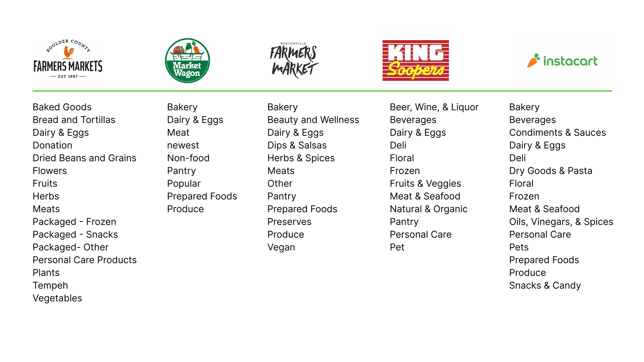
I also studied competitors’ information architecture, which gave me a starting point for grocery categories, which could be further refined through testing.
Define
User Personas
My research data showed two distinct patterns of users, which I developed into personas before defining requirements.
How might we make online ordering as easy as possible, so users can discover unique foods before they sell out?
Ideation
Primary Task Flow
Armed with the knowledge of how my primary users shopped the farmers market, I created a task flow to determine the screens needed for my MVP.
Feature Prioritization
With user goals front of mind, I could validate or invalidate my assumptions about feature requirements. I was interested to learn that all 6 users preferred to browse all products so they didn’t miss out on hyperlocal or seasonal products they might not know about otherwise.
Users also wanted a better way to remember when the order window was open, so they had the best selection to choose from before products sold out.
Design
Style Guide
Boulder County Farmer’s Market underwent a complete brand refresh in 2019, so it was important to work with their existing brand colors and logo. From there, I created components that would be used for the app to create a style guide.
The bright green and orange palette conveys an organic, fresh feeling. I chose a clean sans serif font in two weights to maximize readability, especially considering our 67-year-old persona Nancy.
Low Fidelity Sketches
My goal for my low fidelity sketches was to minimize complexity, highlight featured products and vendors to helps users accomplish their goals, and ensure a smooth flow.
Mid Fidelity Wireframes
Next, I created mid-fidelity wireframes for the screens required for the main task flow.
Prototype and Testing
I conducted a moderated test of the prototype with 3 users to get feedback in real time. I also conducted an unmoderated test with 7 users to gain more confidence in the results. I asked them to: Sign in to the app , Find a description for organic peaches, View information about the farm selling organic peaches , and Add organic peaches to cart and complete checkout.
Wins:
100% of users were successfully able to complete all four tasks
Users liked being able to learn about the farms
“very intuitive” and “easy to use”
“feels organic”
Room for Improvement
Task 2: 4 users clicked on the product image (rather than the product title) in order to find the description. I added that interaction to the prototype
Task 4: 3 users clicked the Peaches product image on the Vendor screen in order to add peaches to cart. I added this functionality to the prototype
Iterations
I also added a notification so that users would know when to place their orders. Currently, they receive a last call email the day ordering closes; however, by then, many of the produce options are sold out. Research suggested that users want to place their order as early as possible, but they need a reminder to do so.
Interactive Prototype
Conclusion
Final Thoughts
Users said they thought the app version would improve the online ordering experience and help them solve their goal of ordering unique produce.
Next Steps
After getting initial approval from the Online Marketing Manager Phil Chang, next steps are to present the prototype to the Executive Director of BCFM.


