Overview
Background
Kaus is a large insurance company that has been selling all types of policies through regional agents for over 30 years. In order to capture a younger market, they wanted to refresh their brand and create a responsive website that made the experience of buying insurance fast and frustration-free.
Problem
Young people would rather spend their time doing just about anything else besides buying insurance. They find it confusing and don’t believe insurance companies have their best interest in heart.
Solution
Design a fast and easy mobile-friendly quote wizard that matches the user to the right policy as quickly as possible, explains why the policy was recommended, and offers clear explanations throughout the process.
Research
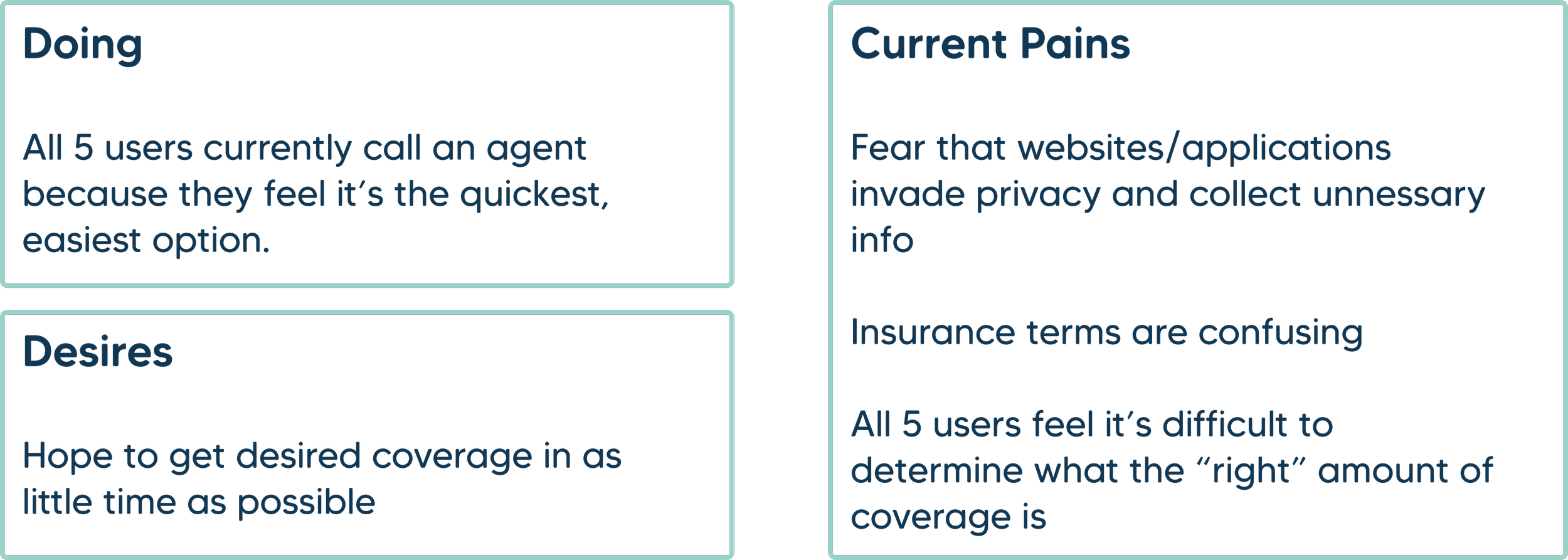
I had three main research goals: to understand users’ mental models for completing tasks on an insurance website, to determine how people estimate the level of coverage they need, and what pain points people experience using their current method to buy insurance.
User Interviews
I interviewed 5 participants ages 28-34 and asked them about their current process for buying insurance, what parts of the process they thought saved or wasted time, what their priorities are when buying insurance, and how they choose between options.
Card Sort
In order to learn users’ mental models when it came to browsing policy types, I conducted an open card sort and told participants to group the policy types in a way that made sense to them.
All five participants came up with different categories, however, there were some trends.
Define
User Personas
After synthesizing the results of my research, I was able to develop a user persona for the target audience Kaus wanted to reach.
How might we design an easy and transparent way for young people to buy insurance as quickly as possible?
Ideation
Primary User Flow
User research revealed that our persona, Autopilot Annie, likely only needed auto insurance, and she wanted it as fast as possible. I chose to make this the primary focus of my design solution.
Feature Prioritization
Based on research, I decided a quote wizard would help Autopilot Annie accomplish her goal of buying auto insurance as quickly as possible.
Users also wanted options when selecting a policy, and they wanted to understand the tradeoffs between different policies, so there needed to be a way to select desired coverage and/or budget preferences - whether it was in the quote process or in browsing filters.
Finally, one of the biggest frustrations revealed in my research was that users often didn’t know what insurance terms meant or whether a policy they were considering would result in too little or too much coverage. I brainstormed using help icons with definitions and descriptions, a chat with a live agent feature, and a “Do I have enough coverage” feature that would use AI to include aggregate data, state minimums, typical claims, etc.
Design
Brand Design
Before starting to design the product, I wanted to redefine Kaus’ branding for a fresh, modern, approachable, trustworthy look and feel. I gathered inspiration online to create a mood board, explored logo ideas, and created a style tile to present to my team. Once I had buy-in, I used the new branding to create a UI Kit for implementing the design.
Rounded corners, a chubby font, and bright teal convey a friendly, youthful feel, while abundant white space conveys simplicity to assauge overwhelm.
Low Fidelity Sketches
I wanted clean design, prominent progress indicator, easy to understand descriptions, explanations for why info was being collected, and a clearly visible live agent chat feature.
Mid Fidelity Wireframes
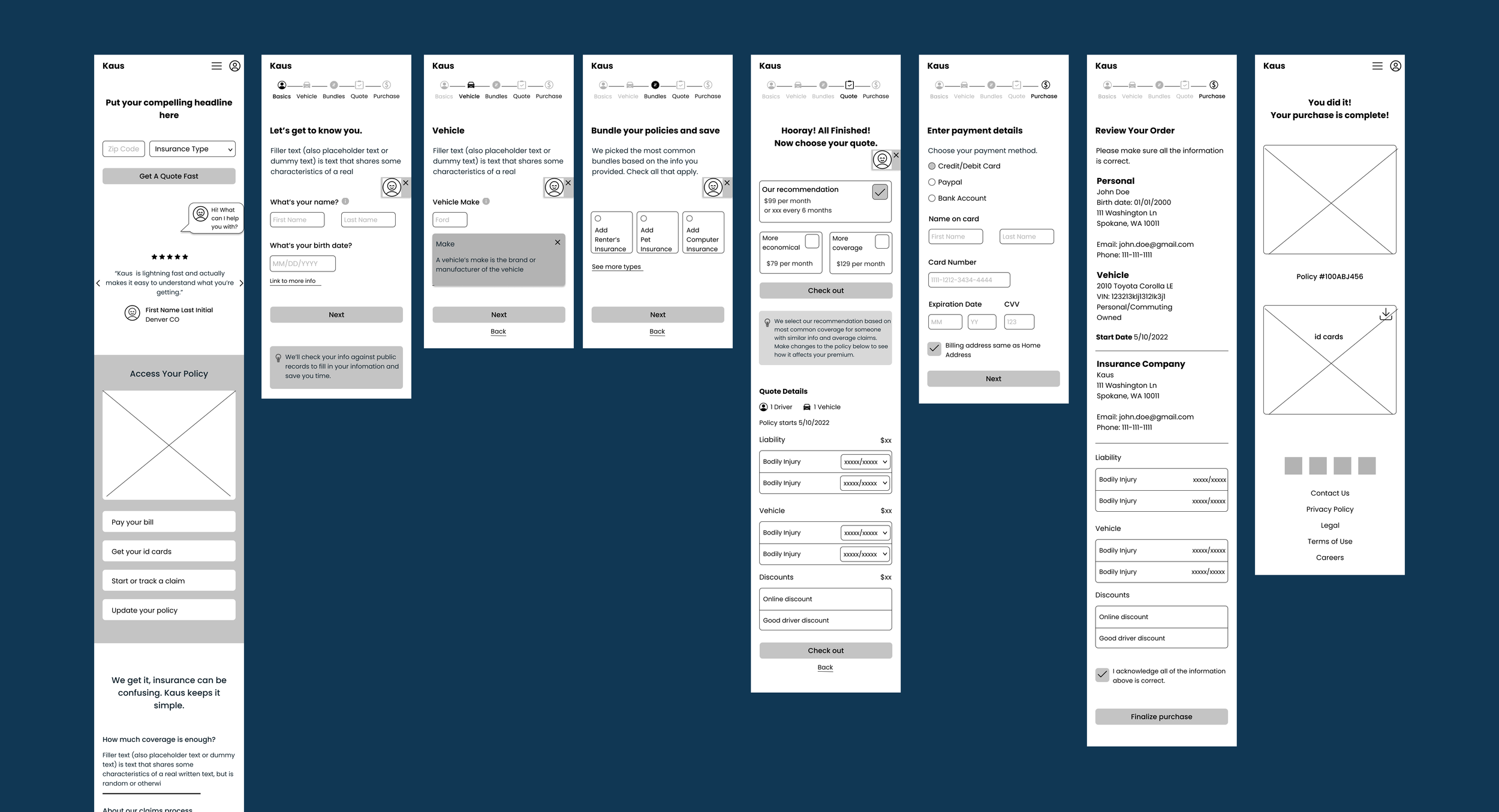
I focused on the main task flow of purchasing insurance through the quote wizard for my mid fidelity wireframes.
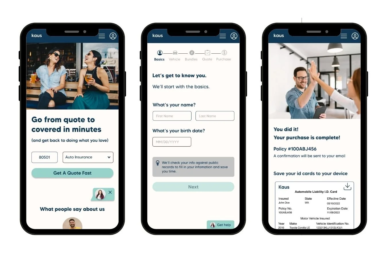
High Fidelity Screens
Once my wireframes were approved, I moved to designing high fidelity screens. In the future, I think there would be benefit to prototyping and testing the wireframes, so it takes less effort to iterate before investing resources into high fidelity screens.
Usability Testing
I recruited 3 smart phone users to test a high-fidelity prototype of the mobile site in person while I observed. All users found the site clear, easy to read, and they achieved their goal of getting insured FAST. However, there were a few key areas of improvement.
Iterations
Interactive Prototype
Conclusion
Final Thoughts
I believe the final prototype solves both the business and user goals to make the process of buying insurance fast and painless. It solves the user’s problem because the site is easy to understand, transparent, and offers help every step of the way.
Things I Learned
While working on this design challenge, I learned that I really enjoy the research portion of the UX process. I strongly believe in validating the problem by listening to users’ actual needs and find pleasure in discovering the bridge between business and user goals.
Next Steps
In the future, there are two key features I would add. First, I would include personalized recommendations in the info modals on the Quote Results page based on the data entered in the wizard. Next, if resources and engineering allowed, I would explore a “Do I Have the Right Coverage” page, where the user could see how their coverage measures up to typical costs of collisions/injuries, etc.


